Thursday, August 27, 2009
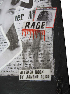
Exhibit - Altered Book - Crimes of Passion 2
Back in July I posted a picture and told about the book I am entering in an art league show tomorrow. I just finished the cover and a few extra touches inside. This link will take you back to the history of this book and to the new pics. Here are the new pics.
As a follow up, I turned it in today (Friday) and the people accepting art had never seen an altered book before. No one was quite sure what to do with it - is it mixed media or is it 3 dimensional? It's both, but they had to pick a category and put it in 3D which means it will be judged with sculptures. Apples and oranges, huh? Anyway they all seemed quite interested in it and I'm pretty sure it will get juried in. Cross your fingers with me. (Updated Tuesday Sept. 1. Notified today the book has been accepted in the art show. Wahoo!) (Updated Friday Sept. 4th. I've been to the gallery and my piece did not win any ribbons. The winner was a huge steel sculpture, and 2nd place was a wonderful wood carving. - Apples and Oranges! How can you compare one to the other?)
I changed the title again. I saw that "What's Love Got To Do With It?" movie about Tina Turner's life was on TV and an AHA moment happened again. I just fell in love with that title for this piece. So, I added a heart on the front, and one inside to help tie the title to the book. I find that the more obscure and thought provoking the title - the more the galleries appreciate the work. They love the challenge of having to think about a piece and try to find the hidden meanings. If it were titled CRIMES - the thought process would be less engaged.
I borrowed a big iron key from one of my art pals, Nancy, and planned to add it to the piece, since the prisoner is obviously locked up and it might be interesting. But when I tried it - it diverted the attention away from the poison bottle - and that bottle and what it contains is the real inspiration and heart of this book. I have the pages wired together so the book can be handled. The gallery people appreciated that viewers would be able to open and close it. Interactive art is something they seem to like. I need to remember that.
Tuesday, August 25, 2009
Practice Book - Prompt #3 Adding text
It's time for a new prompt. Let's play with the alphabet. Write Prompt #3 on the top right of your spread and get ready to have some fun. There are many ways to add text to your pages. Why don't you use this spread to experiment and have samples of all the different types of adding text you can think of. When you are designing a book that's not just for practice, you might just want to add a word, or a phrase. But, this is the practice book - the place to try out things to see what your own style is - or will become.
The fastest easiest way to add text is to pick up a pen or pencil or crayon and write on the page. Print, if you like. Calligraphy. Try writing with your non-dominant hand. Try writing backwards or upside down. Try using a small paint brush. Vary the placement and angles of your words. Let them flow like a stream. Or climb up the side of a mountain. Or over a rainbow. You can animate your words by placing them so they look like they are part of a scene. Like a word being kicked like a ball. Or swirling through space.
There are many products that help you create your text - things like stencils, stickers, and stamps. I am crazy about alphabet stamps. You can mix them up for interesting effects. Remember you can stamp onto fabric, ribbon, metal tapes, etc. Craft and scrapbooking stores have a huge variety of these things that are useful to book artists. Old fashioned rub on letters from an office/print shop are still available. How about Dymo labels? You can use stencils with dimensional paste to get raised letters on your pages. It's fun to use an individual stencil of a letter as part of your collage.
Collage is another method. Cut out words and phrases from magazines when you see them and keep them in an envelope. Maybe you liked the font they used, or the word itself is something meaningful to you. You can cut out sentiments from greeting cards, or old discarded poetry books. Use your computer to type out your text, play with the fonts and colors. Print them out and cut them and collage them onto your pages. Try cutting out your letters individually and gluing them down to form words. Try cutting them out of a photo, or out of a book of text, or music. Use scrabble tiles, typewriter keys, alphabet beads. Do they still make alphabet pasta? Hmmmm......
Sometimes it is effective to put your words on the image itself. Or, you can have them in the background. Writing across and over an image is a way to pull the image into the background and making the words more important. You can manipulate this by layering.
It might be a good idea to have more than one spread for this prompt. Your practice samples will remind you of the technique possibilities for your text. You might want to leave some blank pages here so when you think of other types of text techniques - you can add them later so they are all together when you are looking for an idea to pump up your text.
Do you have the book Alphabetical on your shelf? By Lynne Perrella. I recommend it - not just for the uses of letters - but for eye candy. You'll find a lot of good ideas in this book.
I'm sure each of you have favorite ways of adding text, and I'm sure I missed some - so please add anything else in the comments here. We will all learn together. Linda B. reports "I use a website called ransom note generator to do cool text effects." I'd better check that out too.
Thursday, August 20, 2009
New Altered Book started - White Crosses
I have a copy of a book "White Crosses". It's being altered to show a poem I wrote which is later in this post. I'll be posting pics as the book progresses in case you'd like to watch the process. It's still very much in the formative phase. Not much to show yet. I had an AHA moment, when I started to lay out the poem inside - I found words and phrases in the first chapter that worked as "found text". Just a few. Just enough.
So the book will be in three parts. First the found text portion (which was not something I planned, but something I lucked into). I'm drawing a highway on each page. The backs of the pages have been reinforced with masking tape, since they will get handled and I didn't think they would hold up without some kind of product to strenghten them. Then I painted over the tape. You can see the pages here.
The second section of the book will be my poem with images and who knows what! I'm playing with my favorite photo, using it upside down, right side up, color, black and white, and negative. The strength of this book will be the words (the message). Simplifying the use of images will help maintain that. I'm thinking of just using a raven, various crosses, perhaps a statue of a mourner, a black graphic hand, and the tree. And the highway theme will run through it in some subtle way, if I can think how to do it.
The third section will be a niche in which I will try to make a tree from a branch and put a little white cross on it to look like the tree in my photo. And maybe some dried flowers crushed around it. I work pretty organically, without very firm plans, because the books often take me in a different direction than I started - and usually those changes are for the better.
This is a draft of the poem. The Shrine at the Side of the Road. Copyright 2009 Janene Ford
Driving along a country road
on a sunny afternoon
without a care in the world
happily humming a little tune
as if nothing could interfere.
I know this road.
I've passed this way before.
The miles speed by
as my mind leaves the road
and drifts back and forth through time.
Thinking about all those yesterdays
and what I'll cook for dinner tonite.
a yellow sign
an arrow bent
reduce speed
sharp curve ahead
I see it there
by the side of the road
a white cross nailed to a tree
A shrine for a youth
whose path ended here
stopped by the black finger of fate.
It could have been me.
I've passed this way before.
In his old pickup truck
with a six pack of beer
his life suddenly snatched away.
He lost control
as he rounded the bend
and sped headfirst to his doom.
The impact! The crash!
His truck is now trash.
Broken glass, broken head,
pronounced DEAD!
It could have been me.
I've passed this way before.
How many lives were shattered that night?
How many people mourn?
How many tears were shed
for the brother, the friend, the son?
Nothing can be said,
nothing can be done.
That's the hardest part.
Nothing is slower to heal
than the hole in his mother's heart.
I say a little prayer
for the soul of the one who died
and the lives that were wrenched
by the tragedy,
as I zip past the sad little shrine -
that could have been mine -
had the black finger pointed at me.
I have passed this way before.
I'll pass this way again.
Two young men whose deaths were caused by driving under the influence a few years apart , and whose families I'm close to motivated my writing this. I pass both sites every few weeks. I wanted to express the feelings of the families, and at the same time, connect it to my feeling that I need to be more conscious of the road as I travel so I won't be up against a tree myself some day. I tried to weave both my fears and my sorrow for the loss of these young men through the poem. Please let me know if you think it works.
Tuesday, August 18, 2009
Practice Book - Prompt #2 - The X factor, Part 2
Practice books are so much fun. A place to play and experiment. In art, as in so many things, it's taking a small simple idea and playing with it to find what you can do with it. In cooking, it often is playing with ingredients. Taking a simple dish and adding a little spice, some herbs, changing the type of oil - making it your own dish. You seldom wear a simple black dress without adding your special touches to make it look even better.
The X cut in a book is something that can be tinkered with. Not only with what you can put in front of it, or behind it - but also what about changing the angles of the cuts? How about layering several cuts through several pages. I like to make the first window, then move the cutting mat to behind the next page, and looking through the window, make another X cut - only smaller than the first. When you open the cuts and fold them back - You have a double framed window. You can continue this on down through successive pages before you put your image behind them. This can be very effective.
If you choose to leave the flaps on your windows, you may want to find our own ways to hold them in place. Glue, staples, stitches, brads? Glue dots? Some of the papers are strong enough to roll them back - while others are brittle and break. You will have to work with the inherent properties of your book. Each paper is a little different.
You can tip in a different paper behind a window and cut through it, and when it folds back a printed or colored paper will show through. And if you glue your pages together, the inserted paper will not be visible except where you want it to be.
Play with what will show through the windows. Slip different things behind it and see what appeals to you. A face? An eye? A gun pointing at you? A heart? A cupcake? A frog? A tree? A poem? Something funny? Something sweet? Something nostalgic? Something surprising or scary? If you were making a book of the alphabet - you could put in a single letter. Or something to represent the letter. An A. Or an Apple?
Normally a window has two sides to look through - but you have control over this window. If you do not want to have the window work backwards and forwards, you can glue the page down - either direction. That way the page with the window and what's behind it will show - while the opposite page does not need to have an image or focal point lined up with the window.
If you have any questions please post in the comments section. And if you want to share what you've done, post a link to where we can see it.
Monday, August 17, 2009
Practice Book - Prompt #2 - the X factor
This is so simple, yet so effective. Since this is only the second prompt, it is time to get comfortable with actually cutting into the book. We will ATTACK it!!! With a knife!!!! Do I hear screams? Be brave, it can't fight back! Pick a page with a empty page on each side. Write Prompt #2 on the top right hand corner. Place a cutting mat behind this page. Now, just draw on a medium size x somewhere near the center of the page. Don't go all the way to any edges. Now with your box cutter, or Xacto knife - cut the X. You probably will want to use a ruler or straight edge to make a clean cut. Once you have the X cut, turn back each section and you will find you now have a window. You can cut off the flaps, or leave them there. If you paint them or decorate them, it makes a kind of frame.
Hmmmm...... What can you do with a window? Remember the window works two directions. The page following the window is a perfect place for an image or a word - or an embellishment. Plus, once you have turned the window page, you will note there is a second place of interest on the page preceding the window page. So, think of something fun to put there too. You might want to experiment with a lot of smaller X's to make a whole composition of windows with surprises behind them. Now that the cuts have been made, you can decorate your page to highlight the windows. What would you like to see in the window? What would you Not want to see in a window? I can't upload any pics tonite. I'll try to add them tomorrow. Have fun! Attack!
Wednesday, August 12, 2009
Practice Book - Prompt #1 Follow up
Did you make a page with smiles? What makes you smile? You can include those things. Now, let's look at your page. The rest of us can't see it, so you have to learn to critique your own work. Were you satisfied with the weight of the page (thickness)? If you'd prefer something heavier, you can glue it to the next page. Or several pages. Are you happy with the colors? the size of the image(s)? the way the page is laid out? When you analyze what you like and what you don't - it will help you with the next pages you work on. Go on and make mistakes! You'll learn from them.
By the way, if you have pages you'd like to share, post a link in the comments section so readers can follow your progress and get to know you.
The photo here is for Diane! You know what makes me smile. This is Lulu. A clown of a dog. Nikki is hiding under the pillow with just her nose showing. They can make any dog lover smile!
Altered Book - WATER - gathering phase
An oversized book on Water is the base for a new altered book. On my picturetrail site, there is a book named FISH. It was stolen. I tell all about it there. I thought I'd like to have paper copies of the photos I had taken of the book and insert them into a new work. So, with new print cartridges in the old inkjet printer, I thought this would be a good time to print them out. I also have been collecting images of fishermen and fish, as well as some interesting fabrics and papers that will lend themselves to this piece. When I went online to order the Fred B. Mullett fish stamps I've been lusting after for years, I found that website is down, but by doing a little frustrated searching - I found the Stampdiva.com website and placed an order there. The stamps arrived within a couple days. They will be used liberally in this book and for years to come. Here are some of the things I have laid out. This is the gathering phase. I have not planned the format or layout yet. I'll show more as it progresses.
Board Book - Birds
I am finishing up a quickie board book alteration. Birds is such a popular theme and there are so many ways to use bird images - no wonder we are fascinated with them. Here are a couple spreads. One uses a paper napkin on the right side and a rubber stamp over an image from my old Book of Knowledge. The other spread uses fabric and fabulous paper. The birdcage rubber stamp is from Mail Expressions in Phoenix, Arizona.
Labels:
altered books,
Board Books,
Fabric Covered Books
Tuesday, August 11, 2009
Practice book - Prompt #1- Smile
Let's start off feeling positive about making a practice book. First, select a page and print Prompt #1 on the upper right hand corner. It's going to be a fun exercise - so smile! And make a page of smiles. You can draw them, cut them from catalogs and magazines, stencil them, rubber stamp them or add a photo of someone you love smiling. When you are done, see how many ways you found to express happiness. How many techniques did you use? Did you cover the page with a collage? Or use just one special smile? Your own artistic style will develop as you work your way through a practice book. Maybe you are eclectic and want to try everything! That's perfectly okay.
If this is your first altered book - wasn't it fun to mess around on a page - just for practice? And if you don't like it you can cut it out and try again. Or you have so many ideas you want to do more pages of smiles. Okay, no one will stop you. The Altered Book Police have been laid off for lack of funds.
Sunday, August 9, 2009
Exhibit - Altered book - The Black Dress
This was a really fast book because I only used what was in the book plus images from a variety of sources, a glue stick, some embellishments a box knife and scissors. Here are a few pics. there are 34 spreads in this book. Mostly done by layering cut images and leaving them in the book. I'll be posting more photos to my Picture Trail site.
Friday, August 7, 2009
Aha moments! And a book I recommend.
This is the moment all artists long for - live for. An aha moment, when an idea kicks in and is too good to let it go. Sometimes we work along at something uninspired and it comes out lack-luster. Or we just get stuck and don't have any new fresh ideas. I had a week like that - but I was so busy I didn't really have time to dig into a project so I just puttered with things in my studio hoping the light bulb would come on. We all have a variety of ways to kick start our creative processes. Books have been written on just that subject. I usually wait a few days and look around me until something catches my fancy.
I bought a book called "the Black Dress" at the Dollar Tree a couple days ago. When I looked at it last night, I thought it would be a good candidate for altering. The weight of the paper is really good, the paper is glossy and it has some really good photos. Not all of them are fashion images - some are photos of paintings with ladies in black dresses. And there are already wonderful quotes from designers and others about wearing black - or the color black. I was almost put off of altering it because a lot of the research that I normally love to do - had already been done. If the intellectual process does not engage me in the work - I find it less satisfying - but the the aha moment occurred -and a new slant came to mind. I'm not going to spoil the surprise - I'm about to start working in it and will share it all soon. Stay tuned.
If you are near enough to a Dollar Tree store, I recommend you buy the book. It's well researched, well written and very interesting if you like fashion or art. The book jacket calls it "a lush visual celebration of this fashion classic". And indeed it is. At the back of the book are small photos of the dresses in the book with extended captions which provide details on each dress and it's place in fashion history. I can't believe it only cost one dollar. I think I'll buy another one - and maybe a few for gifts.
Monday, August 3, 2009
Lesson 5 - Getting started
Preparing the pages. To prep, or not to prep? That is another good question. It's a matter of personal choice. I do not prep my pages. I don't see the point. If I need more coverage with paint, I'll just give it another coat. In many cases, I like some of the text to show through. And if you are using collage, the glues will stick to the paper; they don't need paint or gesso underneath. Board books are the exeption. Please refer to the sections on board books.
Adhesives. My personal choice is Golden's Acrylic Gel Medium - glossy. I also use the GAGM with a matte finish. It's a matter of personal preference. Do you want a glossy finish, or a dull one. If you are only using the gel mediums underneath a fabric or papers, it makes no difference. With whatever adhesive you choose, you want a lot of adhesion without a adding a lot of moisture. Adhesives like Elmer's glue are too "wet". Many glue sticks work well. Generally, however I find that the Gel Medium holds better. I apply it with a sponge brush, old paint brushes, fingers, spatulas - whatever is handy. For tiny spots that might be along edges that don't stick well, you can peel it up a little, and work more in with a little brush or a toothpick. Then if you really want a stubborn little piece to stay put - you can gel medium right over the top. I often use glue sticks because they are so handy and easy to use. I also often coat over my pages with gel mediums to hold everything down - or even acrylic glazes.
When to remove pages. I remove pages when I see that the book is getting thicker than I want it to be. If you glue several pages together, or glue on heavy embellishments, or thick fabrics , you will need to remove enough pages to allow the book to close - if you want a book that closes. Think of how you want to store it and display it. That will determine whether or not you want it to be flat. Do not take out hunks of pages. It is better to take out one page here, another there, tearing or cutting at least 1/4 to 1/2 inch from the stitching in the binding. I do this on an as needed basis. That protects the integrity of the book binding - or the whole thing might fall apart.
Subscribe to:
Posts (Atom)