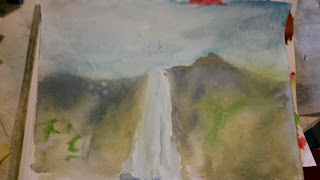
I'm doing the 30 day chllenge so it seems a good time to experiment. Mostly I'm trying to see if these paints, although not created for fine art applications, and I have no idea how color fast they will prove to be - can be used in a painterly way. Most people are using these in art journals and in paper arts applications. They are fabulous for those. The Dylusion sprays are so bright and vivid, I'm finding for my taste, I'm having to dilute them down with water to get the intensity more measured. The Distress inks can give interesting effects with water sprays and drops Wear gloves when you work with the Dyluion inks. Found this out the hard way.
Here are some of the samples I'd done. Mostly you'll see I'm into landscapes right now. Meadows, waterfalls, mountains, water. The basics.
There are green colors here, such as Dirty Martini, Mowed Grass, Bundle of Spruce, Dark Olive. I need to make myself a new color chart with the new colors.
The last three are all with the Distress inks and walnut inks. Faded Jeans for the blue, sometimes diluted with water. Walnut ink in the Eucalypus color is kind of a soft grey with a mere hint of green. Faded linen is the softer beige tones. This grey purple color ( I'll edit the name in later) is an interesting color. When it is applied with the sprayer, it looks grey but as it dries it gets the purple cast. I was not expecting that.
 I'm dabbing out some of the blue in the sky with a tissue. One of the distress staians is white, the Picket Fence. I have it in the dauber and used it randomly on the sky before spraying the blue. Not very successful, the white is more of an ivory white. but it did serve to mix and tone down the blue when rubbed and blotted with a tissue.
 Today I want to lay on some crumpled plastic to see if it breaks up the colors as it dries, as it would with acrylic paint. I'm hoping it makes a rocky looking texture.


Janene, these came out really cool. I love the top two especially, and the names of the pigments are really wild! Thanks for blogging about them...
ReplyDelete